IsabelA2media
Wednesday, 9 May 2012
Tuesday, 27 March 2012
Intrude Final Cut ( after feedback )
Intrude from St Marylebone Media Studies on Vimeo.
We were really happy with our first draft however there were a few things we wanted to change and it made it clear we were right about them after showing an audience and receiving their feedback. This is our trailer after our feedback had been given. The feedback was mostly very positive! they understood the trailer and the genre of our film and reacted in the way that we wanted them to, scared, interested and intrigued...
We had to make a technical change of making our company production logo effect smaller to fit the screen and also to keep the text on the screen for longer as some people said they couldn't read it in time.
We also took away the scream and the heavy breathing in the end scene to see what it would look like if we cut all the sound effects and just left the it with the sound of the floor boards creaking. We thought this was more scary and interesting as the audience wouldn't know if our character woke up or if the stalker got away. However we also had to keep in mind that the scream did scare people and the effect of a trailer is to do so.
FEEDBACK
We created questionnaires to show the year 12s so we could ask them specific questions and get honest feedback.
Wednesday, 21 March 2012
Website
This is my website with my first draft of my trailer embeded with it. I wanted to use a different and darker image than my poster to make it more dramatic. I blured my image in with the black background of the website and also slightly blured the facebook, twitter and blogger buttons to try and keep with the convention colouring of a a thriller/horror genre.
Tuesday, 20 March 2012
Theatrical Poster
This is my offical Poster, the same as my advanced but added with the billing box which gives the impression that it is coming out soon and proberly has a full trailer realsed aswell. I wanted to keep the poster minimlistic to make the audience raise questions to make them more tempted to watch the trailer and then go and see the film.
Poster ( Advanced Teaser Poster )
Alongside my offical final poster, I also did a advanced teaser poster. Lots of films also do this, ( Harry Potter, X men, Halloween, Saw ). I thought this looked good as it leavs a lot of questions, for example who is 'They're' and the fact that the picture is copyed black and white and coloured over each other and slightly off balance gives off a kind of CCTV effect or a blurry image.
These posters as well have strong images not reveling to much of the story or any context about the film
Sunday, 11 March 2012
Music
In our powerpoint we did discuss the music we picked for our tralier, however when our synopsis changed we wanted more suspense and trailler type music. I found a great artist who had lots of tracks which sounded very professtion.
Poster Pictures
I am still deciding which picture to use for my poster. I am putting my billing-board, title and other poster information on all of them to see which one would be most successful.
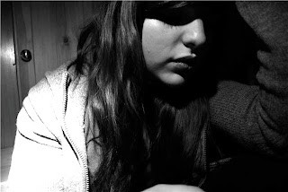
These are other images I liked however not sure the lighting would work with the poster but still going to experiment as i liked the blood tear.
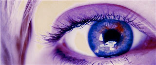
As our story line is to do with Ella ( liv ) being watched I thought it would be good to have an eye as the main focus in the poster would be successful. However i think i would have to play around with the lighting before adding text to my image.
Subscribe to:
Comments (Atom)


.jpg)


